



Safari Adaptive Dark Mode website testing needs a rendered-page check. Reading a CSS colour in JavaScript does not establish how Safari presents that colour after its own transformation. For Nigerian learners building a course catalogue or small-business demo, this is a useful reason to keep source inspection and visual observation separate.
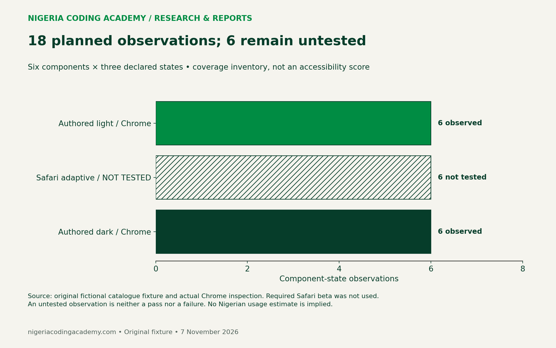
We built an original fictional catalogue with six components and 18 planned component-state observations. We inspected its two authored themes in Chrome, producing 12 component observations and paired screenshots. Safari adaptive mode remains not tested. These materials offer a repeatable starting point, rather than a claim that the beta passed our checks.
What the new Safari beta changes
WebKit’s 3 November announcement introduces Adaptive Dark Mode in Safari 27.3 beta. A user can enable a browser-applied dark appearance for light pages. Pages declaring their own dark support are treated differently. The announcement describes special handling for icons and images, leaves canvas content unchanged, and says JavaScript colour queries expose authored values rather than transformed colours. The “only” keyword is unsupported in beta 1.
The same announcement cites almost 40% of page loads from users in dark mode and 10% supporting dark mode, drawing on Chrome metrics. Their collection periods are unstated there. We could not independently retrieve those metric charts, so we attribute these approximate figures to WebKit. They are not Nigerian usage estimates or Safari market shares. Their overlap is unknown: subtracting them would not establish the share of dark-mode users encountering unsupported pages.
Build a small page with six different risks
Our fixture is a fictional course catalogue. Its ₦25,000 price is invented teaching content, not a course offer, market price or affordability finding. The page uses no remote scripts, tracking, account credentials or submitted form data.
The component list deliberately mixes text and image behaviours. Ordinary text answers whether readers can follow the description. A naira price tests a short, important label. A validation message checks whether the instruction remains understandable beyond its colour. An SVG book icon, a bitmap logo and a canvas chart create three different visual assets to inspect.
| Component | Question to record |
|---|---|
| Ordinary body text | Is the description visible against its actual background? |
| Naira price label | Can readers read the currency and amount without guessing? |
| Validation message | Does the wording explain the error independently of red? |
| SVG icon | Is the icon distinguishable, with an appropriate accessible name? |
| Bitmap logo | Does its background or edge create an unexpected visual block? |
| Canvas chart and text values | Are labels readable, and do adjacent values preserve the meaning? |
Six components across authored light, Safari adaptive and authored dark states give 6 × 3 = 18 planned observations. The worksheet is a test inventory. Its row count does not measure accessibility coverage or make a representative sample.
What we actually inspected in Chrome
On 7 November we opened the local fixture in Google Chrome and used its visible “Authored light” and “Authored dark” buttons. We captured both rendered pages and read the authored foreground and background colours. The retained environment ledger records the installed Chrome version, macOS version/build, a 1920 × 824 CSS-pixel viewport and device-pixel ratio 2.
Browser zoom and system appearance were not independently captured. The fixture used explicit theme buttons, so these observations should not be represented as a controlled system-theme experiment. A repeat tester should record those missing fields before comparing a different device. No Safari beta was installed or tested for this article.
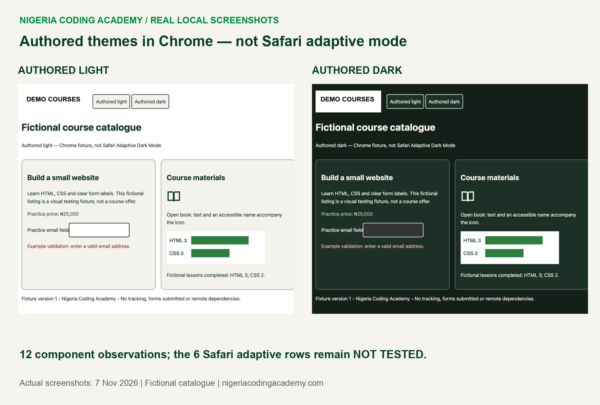
The two pages displayed their text, price, validation wording, icon, logo and chart. The icon changed with the authored current text colour. The bitmap retained a white rectangle, while the canvas kept its deliberately painted white background. Adjacent text still reported the fictional values: HTML 3 and CSS 2.
These are bounded visual observations. We did not run a screen-reader evaluation, measure reader task success or certify the page’s accessibility. An accessible name appearing in the browser tree is useful evidence about markup, but does not establish the experience in every assistive technology.
Calculate authored contrast without overstating it
We calculated relative-luminance contrast for the three ordinary-text components against their authored card background. This creates six colour-pair calculations across the two authored themes. The underlying RGB values and unrounded ratios are downloadable.
W3C’s explanation of WCAG 2.1 contrast sets 4.5:1 for ordinary text, with exceptions, and 3:1 for qualifying large text. These are established criteria, not a new November rule. Threshold comparisons use unrounded values. Logo exemptions and non-text requirements need their own assessment; a text contrast calculation cannot cover every component.
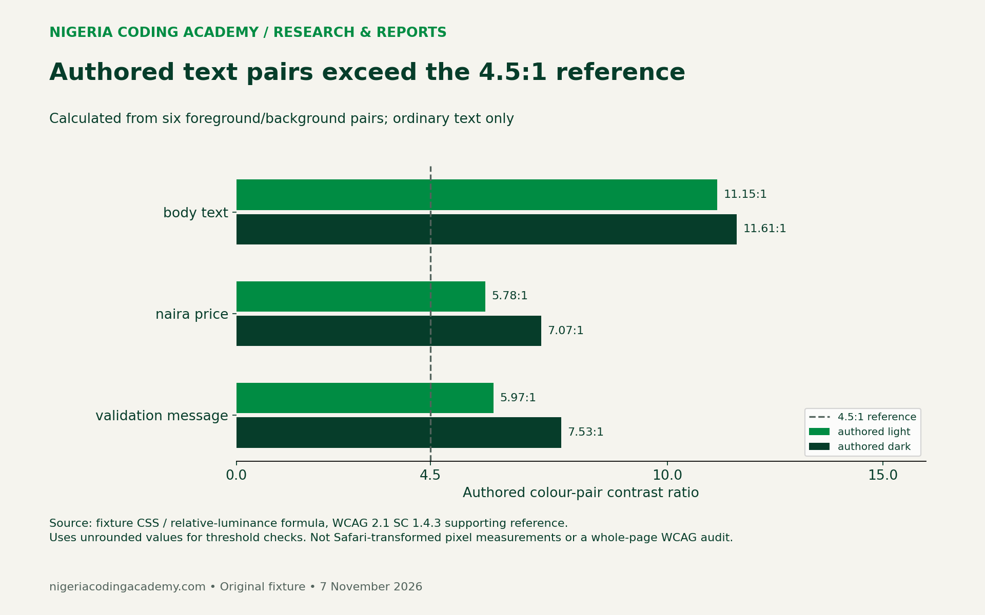
A passing authored pair is still only one part of the evidence. Check the actual element against its real background, including overlays, focus states and images. Keep text large enough to read. If a screenshot looks faint despite a strong nominal pair, investigate rendering, font weight and context rather than treating the number as permission to stop looking.
Why DOM values and rendered appearance need separate evidence
The infographic separates the author’s CSS, a JavaScript reading of that CSS, and the browser’s visible output. For Safari’s adaptive transformation, WebKit says the JavaScript reading remains the original authored colour. That reading therefore cannot serve as a detector for whether adaptation occurred.
Unlock Your Unique Tech Path
Get expert tech consulting tailored just for you. Receive personalized advice and solutions within 1-3 business days.
Get Started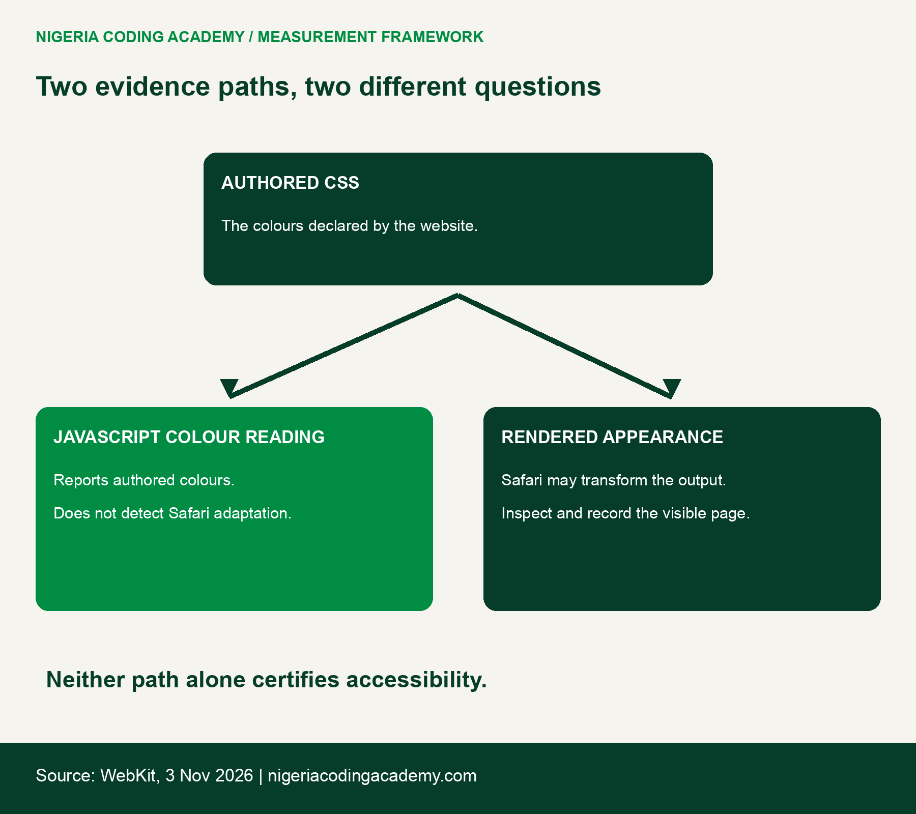
For example, a price label can have a calculated authored contrast ratio yet appear beside a logo or chart that needs separate attention. Record the screenshot, component and visible issue together. Do not replace an unavailable Safari observation with the corresponding Chrome result.
Use the downloadable test pack
The fictional catalogue fixture and evidence pack includes HTML, the synthetic bitmap, screenshots, raw colour observations, calculation code and instructions. Extract it, serve its fixture directory locally, and open it in the browser being evaluated. It makes no external service calls.
Download the structured assets separately:
- Blank 18-observation worksheet (CSV)
- Actual Chrome component observations (CSV)
- Six authored-colour contrast calculations (CSV)
- Source and denominator ledger (CSV)
Start a fresh worksheet for a real Safari 27.3 beta session. Record its exact build, OS build, zoom, viewport and system appearance. Confirm the user-visible adaptive setting and retain an actual screenshot. Then inspect each component, including keyboard focus, labels and whether error instructions make sense without colour alone.
If the required browser is unavailable, leave its rows not tested. If a visual issue appears, describe what the reader cannot distinguish and its task impact. A neutral observation such as “logo retains white rectangle” is more informative than declaring every design difference a severe failure.
Turn the exercise into a useful project review
A Nigerian study group can divide observation and implementation roles without assuming everyone owns an Apple device. One learner can prepare the catalogue and source ledger. Another can inspect authored themes in an available browser. A participant with the required Safari beta can later contribute a separately labelled adaptive-mode session.
Use our CI evidence-contract exercise to keep the same discipline: report what was examined and what remains unknown. A green badge or successful colour calculation should not silently claim an unperformed browser test.
Choose an authored dark theme when the product needs deliberate control over branding, charts and component states. Retest the rendered result after changes. The original contribution here is an inspectable fixture and an honest evidence boundary, not a Nigerian adoption forecast, battery claim or guarantee about evolving beta behaviour.
Suggested citation: Nigeria Coding Academy, “Safari Adaptive Dark Mode: Test the Rendered Page,” original fictional fixture and authored-theme observations, 7 November 2026. Cite the browser and state alongside any reused observation.


